 The pizzeria “Alla Lettera” opened a little over a week ago in Turin. It is architects yet|matilde's homage to the world of typography and, therefore, to the shape of words.
 “The 'alla lettera' project comes to life thanks to the entrepreneurial figure of Marco Bonomi, his enthusiasm and his curiosity which remind so much of Gavina and Castelli of the 50's and 60's in the industrial environment” say the designers. “Another client would have probably (and perhaps rightly) set specific limits starting with the name of the premises (it came to us from the location of the restaurant in Piazza Bodoni, Turin), with Marco, however, discussing and planning together was immediately exciting”.
 Cooking and graphics are two worlds with common project dynamics, in which the mingling of the senses and needs dwells. The outfitting of the premises comes from this parallelism, the use of the typeface character ingredient in any graphic or physical form, by creating elements from scratch or re-using existing elements. Moreover, at a time when the publishing industry is abusing of the food culture to sell, why can't a pizzeria use editorial language to connote its own spaces?
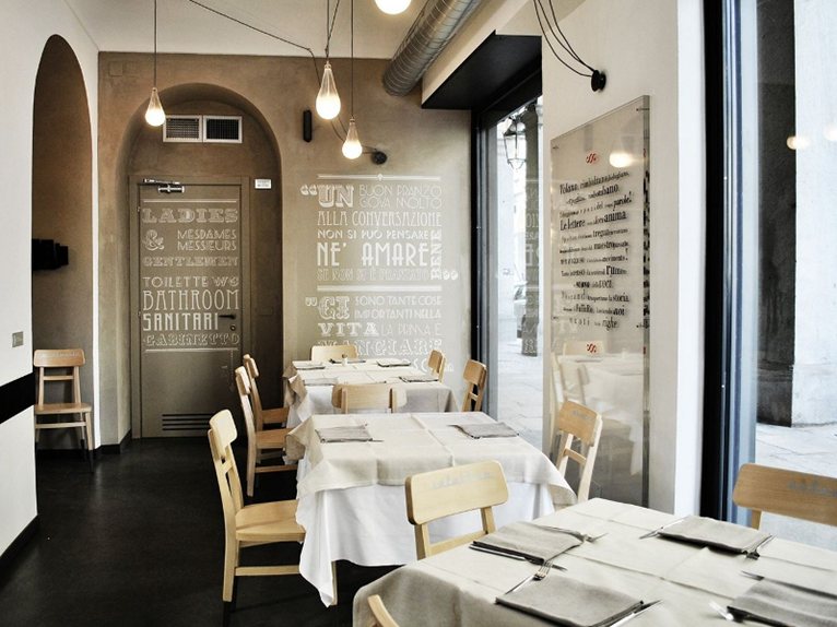
 The image project, which has the task of presenting and introducing the entire project, uses the Bodoni font in its logo, and introduces the outfitting theme in the logo, by using the “O” of different families, to represent the business's basic product, the pizza. Because every pizza is similar to all the others, but always different, because it is made by hand.
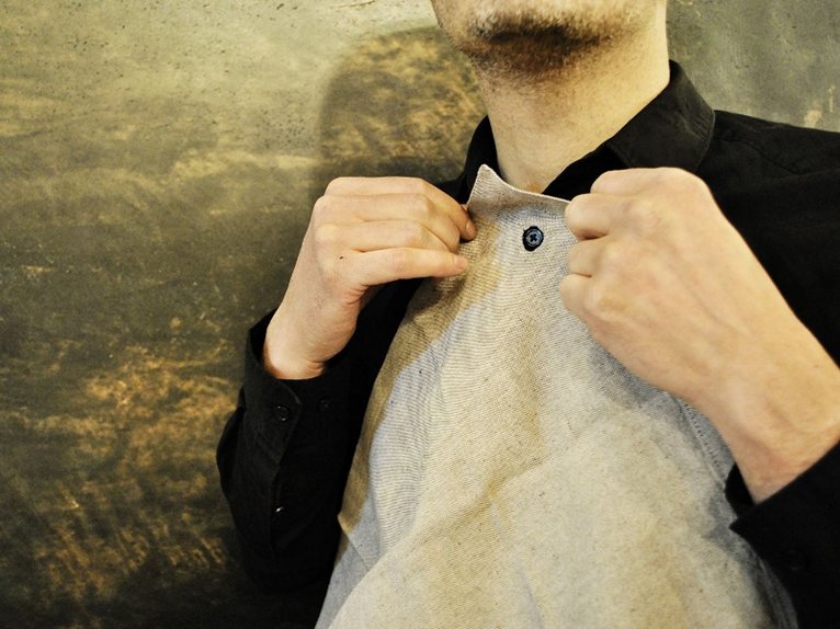
The menu is designed to look like daily newspaper; the staff uniforms, overseen by fashion designer Antonio Rizza, are inspired by those of the printers who used mobile type with sleeve covers too.
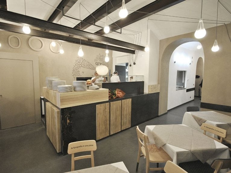
The restaurant aims to be a place in progress, developing, therefore, the materials used are all “unfinished”.
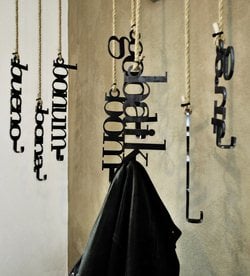
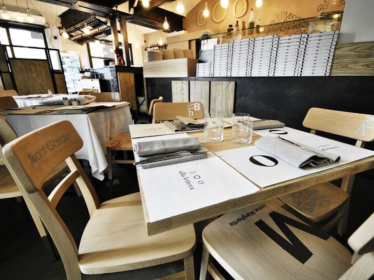 There are many similar, but always different, objects characterising the outfitting: the lamps, specially designed by the Operai del Design, are made by ensuring that the operator avoids conforming the shape during the handicraft phases of the production process; the chairs are “snatched” from industrial production while still untreated and are then individually customized.
Careful functional research was carried out for designing the equipment necessary for correctly carrying out the activity inside the premises, from the design of the sideboards (destructured for better flexibility) to the napkin (which has a button hole and thus means that it can be slipped onto a shirt button).
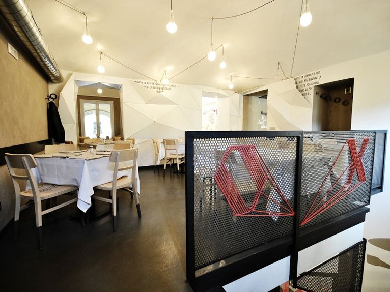
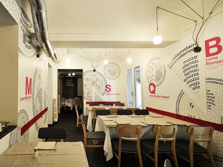
 The great compositional variety that the theme suggests is represented through the individual customization of the rooms making up the premises, performed by people working throughout the project. Every action has a dual level of understanding: a first level of purely expressive attraction, while a second level reveals additional information and references, highlighting the didactic approach of the whole project.
Indeed, every good project, should be the bearer of culture.
The customization of the rooms will be periodically updated, always on the look-out for new experimentations.


 209
209
-

Antonello Barletta
comment...originale!