07/11/2013 - The Rio 2016 Organising Committee for the Olympic and Paralympic Games today launches its sport pictograms, continuing the tradition of each edition of the Games defining the sports on its programme through graphic icons.
“For the first time, all Olympic and Paralympic sports are individually represented. This is one of our unique contributions to the history of the Games,” said Carlos Arthur Nuzman, the President of the Rio 2016 Organising Committee.
During the creative process for the Paralympic pictograms, Rio 2016’s team of designers sought to portray the integration of the athletes’ different impairments with sport in a balanced, natural way, depicting prostheses, blindfolds and other elements.
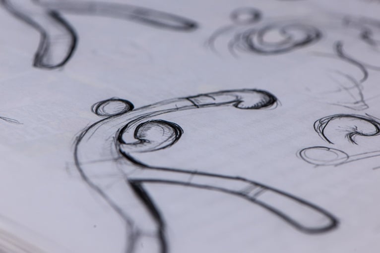
The word ‘pictogram’ comes from Greek and Latin. Originally, it means ‘painted word’. This original meaning was the source of inspiration for the first strokes of the Rio 2016 pictograms, which were based on the official Rio 2016 typography. After researching each sport, the first strokes were made by hand.
These strokes were then reconstructed on a computer, fitting the contours of the letters. The athlete bodies and sports equipment were built from the characters, or part of them, in a continuous stroke, with variations in thickness in order to give the impression of depth. The pebble shapes, which are a characteristic of Rio 2016’s visual language, support the designs and alter their shape according to the athletes’ different movements. Work was completed in 16 months, five of which were devoted to the validation of the pictograms by the 42 International Federations.
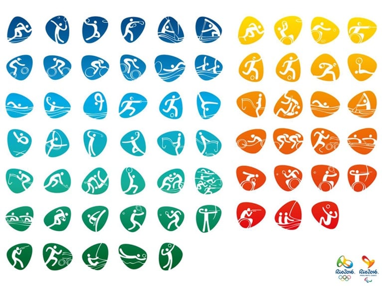
In total, there are 64 pictograms, 41 Olympic and 23 Paralympic. (Check it out) The pictograms can be used both inside and outside the pebbles, in all colours. Rio 2016 Brand Director Beth Lula said they are important tools for engaging the public from an early stage. “The pictograms, from now until 2016, will serve as a communication platform for the promotion of the sports, for partner activations, and will be present in all the Games’ visual identity, including their application in venue decoration, signposting, tickets and licensed products, among other things,” she said.
The development of Rio 2016 pictograms (Photo: Alex Ferro)
The origin of the strokes: the Rio 2016 font
The development project of the Rio 2016 font, launched in July 2012, was one of the innovations of the Games’ branding programme. The typographic concept, developed by Dalton Maag, was inspired by the letters and numbers of the Rio 2016 logo and the essence of the Games — passion and transformation — which links the Olympic and Paralympic brands.
Based on the contours of Rio, the font represents elements such as the calçadão de Copacabana (Copacabana promenade), which is depicted in the letters ‘m’ and ‘n’, and the Pedra da Gávea (a mountain in Rio de Janeiro), which is depicted in the letter ‘r’. The letters are drawn with a single, continuous stroke, an agile and fluid movement that suggests the movement of athletes.
The Rio 2016 Organising Committee for the Olympic and Paralympic Games opted to set up an internal design team for the creation of the Games’ main graphic elements, probably one of the world’s most complex design projects. In addition to the designers, a group of 28 other Rio 2016 staff were directly involved in the development of the pictograms.
Source: Rio2016 Press Office

comment